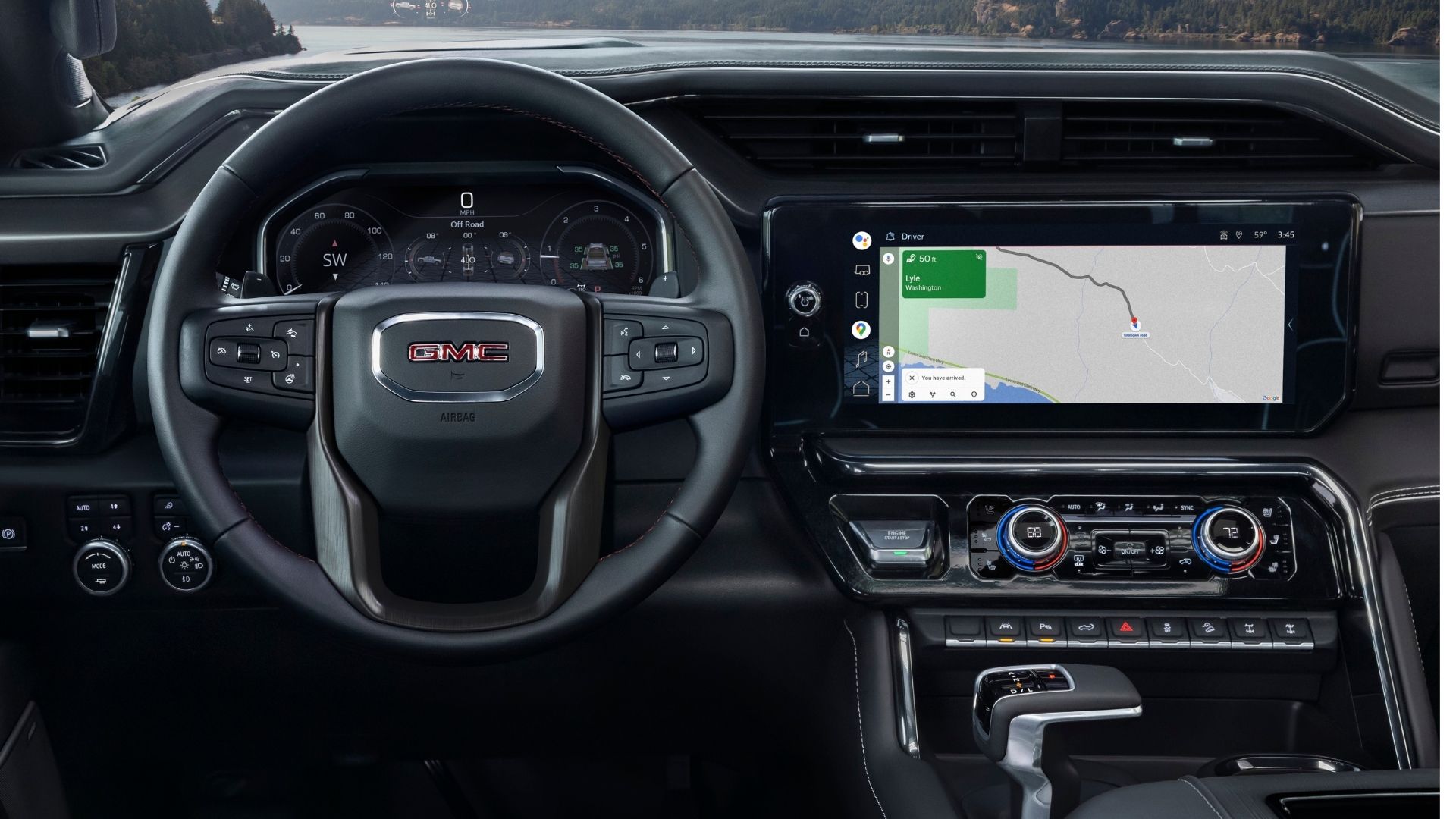

Vehicle interior design trends morph in waves, and some automakers try to change it up completely to shake things up. Take, for example, the evolution of the gear shifter in all its myriad forms. In any given vehicle on the market, you’ll find everything from a more conventional shifter in PRNDL order next to your right leg, or dials, buttons on the dash, or slim stalks on the steering column.
When larger infotainment screens started becoming a thing several years ago, automakers (notably, Tesla) started experimenting with the orientation, shape, and integration of the screen itself. Truck interior designers aren’t immune to the temptation to tinker, and some have gravitated to a prominent vertical orientation. Not GM trucks, however.

General Motors is sticking with horizontal design cues for its trucks and currently, there are no plans to change that.
“Our full-size trucks currently use horizontal screens to reinforce our design philosophy built around width and spaciousness,” GM’s Director, Interiors Design Chris Hilts says. “For example, we can accommodate a first-row center occupant without sacrificing the large, premium display.”
Like many design components, the vertical screen orientation is met with adoration or absolute frustration. Ram, for instance, made a splash in 2019 with the launch of its redesigned 1500, including a massive vertical screen that sent many into paroxysms of delight. From a personal perspective, I like having the option to split the screen with nav on top and the music display on the bottom, placing the most important information at eye level.
News site GM Authority laid out a comprehensive overview of screen displays for several brands.


“[A] horizontally-oriented approach makes even more sense when we consider that Apple CarPlay and Android Auto both display information in a horizontal rectangle format, and Tesla – known for its large, vertically-oriented screens, doesn’t support either of the two technologies,” author Vince Brown writes.
From a safety perspective, designing the display for optimal eye sweep across the dash while keeping the driver’s attention on the road is paramount. Having a large display with a lot of information available is helpful in many ways and automakers are following technology trends outside of the car world as well. Consider, though, that, leading the driver’s eyes downward in any way could be hazard contributing to distracted driving. My colleague James even makes the argument that touchscreens in general are a hazardous fad. Peter says we don’t need bigger screens, we need lots of tiny ones.
One thing I noticed about Toyota’s upcoming bZ4X EV is that the driver information display is mounted higher than usual. It’s somewhat of a physical version of a digital head-up display, which would keep my eyes much closer to the road. And maybe GM is on the right track here; while its brands are focused on freeing up the middle bench seat with horizontal screens, it may also offer a higher level of safety.
Vertical or horizontal? Comment below or send a message to kristin.shaw@thedrive.com.