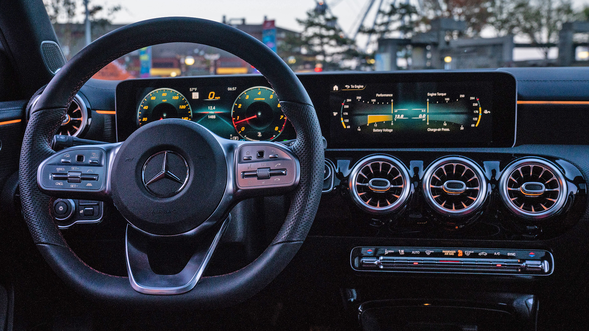

Truly new automotive infotainment systems—not just updated versions of existing platforms—are few and far between. Designing a completely new interface that will be deeply integrated into all the car’s systems and can be adapted to every vehicle across the lineup takes years of planning, development, and testing. As a result, the systems tend to hang around for a long time. Variations of the now-dated Mercedes Comand system have been available in its vehicles since 1999. It’s turn-of-the-century tech. Now, though, with its release of MBUX (which stands for Mercedes-Benz User Experience), Mercedes hasn’t just caught up with the automotive world’s current state-of-the-art when user interfaces—it’s leapt soundly far enough ahead to keep the carmaker there for what’s likely to be a long time.
The new system, which I tested in the new 2019 A-Class during that vehicle’s launch last week, is a huge improvement over the previous setup, bringing significant new innovations which, at the moment, no other infotainment arrangement can match. These include using artificial intelligence to learn your preferences and divine answers to your spoken queries; augmented reality to superimpose navigation data onto a wide-angle image of the road ahead; and natural language that allows you to speak informally instead of memorizing a roster of commands. It also has smooth, dynamic graphics and a wide variety of control options—track-pad, steering-wheel controls, touchscreen, and conversational queries. That’s a lot to wrangle into a new system, but MBUX is intuitive enough that most users will easily slide into it.

First contact, of course, comes with the visuals, which are lush and sophisticated—a breath of fresh, modern air compared to the low-res scrolling-tile motif of the previous system. The A-Class I tested had dual 10.25-inch displays, mounted side by side in such a way that they appear to be a single, ultra-wide screen. (The base system includes dual seven-inch displays.) On the left, directly behind the steering wheel, lies the primary instrument cluster, which can be presented in one of three styles: a streamlined presentation of clock and modestly rendered speedometer; a standard version that allows you to customize three zones to display the data you want; and a performance-driving-inspired screen that’s dominated by a big speedometer and tachometer.

On the right lie the navigation, entertainment, and vehicle-systems interfaces, which present as scrolling icons that you access by swiping left or right, or using the hand controls to do so. If you swipe vertically, you’ll see the systems that the AI has deduced you want and use the most—your bookmarks, if you like. The graphics are crisp and dynamic, offering, for instance, a rotatable rendering of the vehicle you can tap on via the capacitive touchscreen to activate different features. The system has almost no latency, and is quick and precise—though the capabilities you sometimes have aren’t always obvious. (For instance, determining what precisely the point of that spinning car is can be a bit unclear.) The hardware driving all this reads like the specs of a legit gaming rig: NVIDIA chips, 8GB of DDR4 RAM, a six-core central processor and graphics processor with 128-256 CUDA cores, and something about “gigaflops” I don’t quite understand.

The key plug for the system is its artificial intelligence, which is both local—in that it learns your preferences and adapts to you—and systemic, by virtue of the fact that the cloud-based system learns from all users how to grasp language and intent, amid all the idiosyncrasies of human behavior and communication. In short, it will only get better over time.
To activate the system, you wake it up by saying, “Hey Mercedes,” then give it the instructions. You can ask it to adjust the temperature in five degree increments by simply stating you’re too cold or hot, or tell it to call your boss. (You can’t actually have the system hold the conversation, though. Yet.) But you can already casually ask it for highly specific destinations—one example went, “find me an Asian restaurant, but not Japanese, in downtown L.A.”—or inquire about scores and game times for your favorite football team. There are limits to what it can do, but they’re not very clear, so you will find yourself asking it to do things you might as Siri or Alexa to do, and be met with a silent shrug from MBUX instead. Still, it’s a strong start.
Another great trick: the use of augmented reality in the navigation system. The right-hand screen can display a forward camera view as you approach an intersection, for instance, and superimpose a directional arrow with subtly shifting colors. It also “projects” house numbers onto properties you pass. The system is both handy and very cool to watch—an indicator of where augmented reality is heading in the very near future.

There are some quirks and hiccups. For starters, there’s the somewhat-confusing name, MBUX—which is meant to be pronounced “Emm-Bee-You-Ex,” but which I instinctively pronounce as “Emm-Bucks,” as though it were one of those phony currencies soda companies use to get buyers to collect bottle caps. (The name’s not going anywhere for at least a decade, so we’re going to have to deal with it.)
Then there’s the partnership Mercedes has with What3Words, a navigation system that allows users to enter any destination simply by uttering three words assigned to it. The company does this, via an algorithm, for 57 trillion three-meter-by-three-meter squares on the globe. It wasn’t clear how to engage that in the navigation system, and it fell through the cracks during the press launch, so I’ll reserve judgment.

More pressingly, though, the natural-language voice interface works well, but it does occasionally seem to ignore queries when it can’t interpret them instead of telling you what’s going on—the aforementioned silent shrug. Also, MBUX has a hair-trigger; though it’s supposed to respond just when you say “Hey Mercedes,” during my drive, it chirped up every single time I or my drive partner even said the word “Mercedes” mid-sentence. This was on a Mercedes press launch with another journalist, and the main subject of most of our conversations was, naturally, Mercedes, so it came up a lot. It likely won’t actually affect real-world users very much, unless they’re obsessed fanboys (or somebody in the car happens to be named Mercedes).
Finally, navigating the system isn’t all that obvious yet. There are still moments of jabbing at screens when you can’t quite figure out how to get to the menu you want quickly, and there are moments of giving up on a query that the system just doesn’t quite get. But these are mostly problems of inexperience that will undoubtedly smooth out after a few minutes of use, when you start playing along with the system’s logic. And luckily, it looks as though MBUX will also be much more aggressively updated by Mercedes than its predecessor, including secure over-the-air updates via the car’s wireless data system. Expect tweaks to materialize to further refine and hone the interface.

Ultimately, the MBUX experience is satisfying because it works harder than any other system available to help the user. Mercedes goes so far as to say that the automatic customization, natural-speech recognition, and AI brain create an “emotional connection between the vehicle, driver, and passengers.” That sort of language tends to overstate reality by a good margin; I don’t know that I felt particularly bonded to the A-Class after using MBUX for a day. But I will confess to enjoying the system and admiring its command of the vehicle, my own digital sphere, and the world around us.
Frankly, MBUX is the best infotainment system the automotive world has going right now—and that’s not mean to be qualified praise. User interfaces work a really tough room, forever treading on the perilously thin ice of owner adoption. After all, when stymied by a misstep while learning a new interface or put off by a few botched responses from a digital assistant, many simply throw their hands in the air, relegating themselves to a life of steering-wheel controls and touchscreen taps instead of using the voice commands and AI that hover just below the surface, waiting to be summoned. Hopefully, everyone will dig in and embrace the system, because there’s real benefit lurking here. MBUX’s layup might be a little awkward at times, but it’s still a slam dunk.