
Vehicle user interfaces—the infotainment touchscreens, dials, and buttons that riddle new cars—have been a tough nut for carmakers to crack. They need to be intuitive and functional, without becoming a distraction. They also need to be accessible and easy to access, and not force drivers to frequently stretch to reach a touchscreen mounted as close to eye level as possible. Finally, they need to not be too, shall we say, experimental. Many a carmaker has fallen on its face in pursuit of gesture controls, whirling multifunction dials, and “programmable” buttons that never quite seem to sync up with what you actually hope they’ll do.
Acura’s new third-generation RDX, the compact crossover that debuted at the New York International Auto Show last month, takes a fresh swing at user interfaces with a system that’s the first real-world manifestation of the ideas the company introduced in its Precision Cockpit concept at the 2016 Los Angeles Auto Show. That system had a variety of display ideas at work, many linked to future semi- and fully-autonomous driving—but the core of it was the new touchpad, which Acura has rebranded as the Intuitive True Touchpad Interface. It debuts in the RDX coming out this fall, but I spent some time with the technology recently to see how it works.
The idea behind the new touchpad system is simple, but it represents a fairly significant shift in logic from conventional touchpads. Most of those work as a cursor guide, where your finger movement is replicated by a mouse-like arrow on a screen or through the cycling of highlighted buttons, enabling you to control the screen remotely without having to reach for it if it’s even slight slightly out of reach. Touchpads like these are common in cars; few, however, are quick and easy to use, mostly because your eyes have to linger on the screen for several seconds while you sort out where the cursor has popped up or which “button” is highlighted.

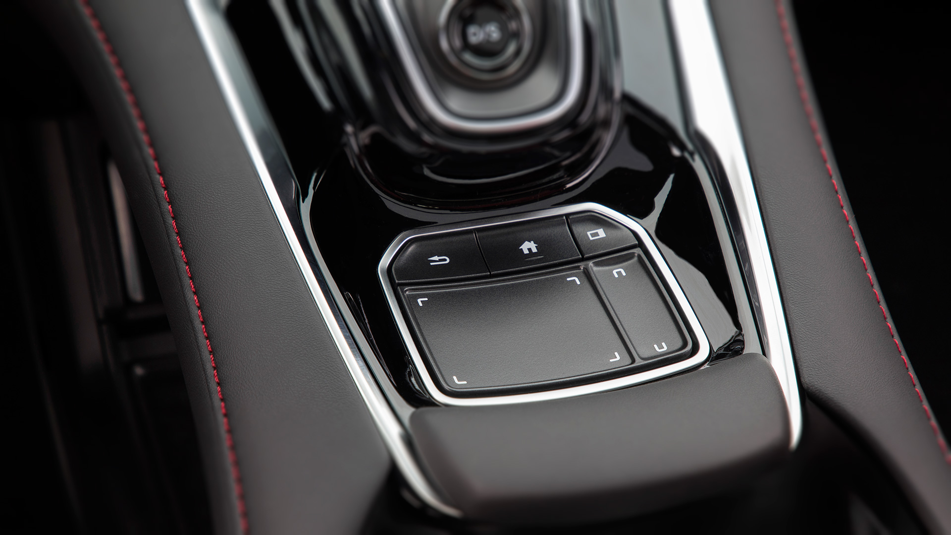
Acura’s system takes a different approach. Instead of the touchpad being used as a control mechanism for a cursor, it’s essentially a “duplicate” of the screen mounted in the dash, at least from a geometric perspective. So if you touch the pad in its bottom-left corner, for instance, whatever button on the screen is in that position becomes highlighted, and then activated with a press. Same for all the buttons on the screen—you simply touch where the button would be on the touchpad, and boom, you’re on it. (This is known as absolute positioning, compared to the relative positioning used in cursor-based systems.) Dragging your finger around the touchpad does have a similar effect, but it’s not essential to finding your desired target. You can go right to it, guided there by your muscle memory of the pad itself, which is curved at a slight concave angle to help with that retention.

The 10.2-inch high-def center display stays in your line of sight, without needing to remain physically accessible. But the pad’s placement directly beneath your natural hand position while driving, complete with wrist-rest, makes it natural and easy-to-use interface. The pad also includes the familiar “back” and “home” buttons, as well as a second sub-pad that helps you control the smaller and larger zones found on the display; this second pad includes the ability to quickly swap the info on those two, should you rather switch from a large music player and a small map to a bigger nav setup and a smaller audio display. The system allows for snappy and efficient navigation of menus and options, without forcing you to take your eyes off the road for an extended period. It’s truly as if the screen were there beneath your fingertips, and when you become truly conversant with it, you use it as such—though without having to stretch, or leave smudgy prints all over the screen.

Acura partnered with Ohio State University to develop the system in the school’s driving simulator, said Stephen Frey, the engineering design leader for the 2019 RDX. In addition to making the physical interactions smoother, easier, and more intuitive, the company also sought to organize the displays better.
“The applications use clear words that people understand, and we worked to find out what people want to use most in their systems,” Frey said. “We floated those actions to the tops of the menus, making the most common things that people typically do immediately accessible.”
As a result, things like audio favorites and phone contacts are positioned for quick-draw selection. The head-up display and the smaller instrument-cluster panel, as well, have both been revised and optimized for natural use, with a range of customizations that—while initially a bit overwhelming—will allow you to dial-in the system precisely as you want it if you spend some time sorting out precisely what you want, and where. But of course, the touchpad is the key trick—and while evolved, it’s still a new kind of thing, as any user interface experiment is to some extent. But Frey says it has been engineered specifically to be a fast-learn experience, with users able to start swiping and swirling with the briefest of introductions.

For the most part, that’s true. I was able to quickly grasp the system’s logic in terms of screens and menus and getting where I wanted to go with the least amount of effort and exasperation. I did, however, encounter a bit of a hang-up while reprogramming my brain to accept that fact that I wasn’t actually looking for a cursor on the screen while using the touchpad. Simply landing your finger on the spot on the screen that corresponds to your desired function takes a bit of getting used to—but once you do grasp its logic, it works very nicely. My other hang-up came while trying to swipe left or right to cycle through menu options. It always felt as though the screen elements were moving in the opposite direction of that in which I flicked, but in truth, it was merely a minor hand/eye coordination lag at work. It works precisely as smartphone swiping works, and once I got the hang of it, the issues quickly fell away.
I also, in the most minor of quibbles, found it a bit frustrating as a dedicated iPod junkie that I couldn’t scroll through the tracks on a given playlist without repeating several menu steps each time to get there. It would be nice to be able to simply scroll the knurled thumbwheel on the steering wheel to spin through the tracks to find your next song, or to be able to use the new touchpad to swing through. You can skip tracks easily enough, of course, but you can’t just browse your current playlist.
But as I said, that’s a minor quibble in a major overhaul that fixes many big problems with today’s user interfaces. As the first definitive rollout of the Precision Cockpit idea, the 2019 Acura RDX is a laudable debut.
