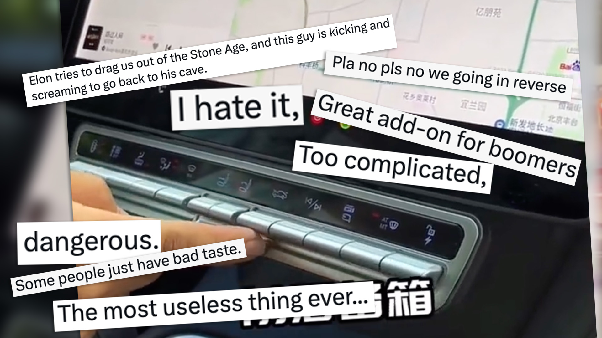

It’s fair to say that Tesla started the minimalist, touchscreen-centrism fad that has inundated the auto industry. But the touchscreen tide is washing out again, and some Tesla owners are riding the ebb. In one case, a Chinese Tesla Model Y owner has installed a button panel to their car, and some of their fellow Tesla owners find the mod deeply offensive.
The installation was shown in a video from an unknown Chinese social media platform, which has since spread to Twitter. In it, a Model Y owner installs a plug-and-play button panel beneath the touchscreen, which controls functions such as climate control, door locks, and the trunk release. On top of letting the driver operate these (and other functions) without taking their eyes off the road, the row of buttons fits with the Tesla’s design and color scheme, looking like it could’ve been factory-installed. All in all, a win-win.
Some Tesla owners don’t see things that way.
In comments responding to the tweet, most take a “to each their own” stance, with some praising the added buttons as an improvement. Others, though…
- “Elon tries to drag us out of the Stone Age, and this guy is kicking and screaming to go back to his cave.”
- “I hate it, it would never be in my M3”
- “The most useless thing ever…”
- “Great add-on for boomers”
- “Will he slap a blackberry on top of my iPhone too?”
- “He’s similar to that woman in the US who tried filling her Tesla with gas at the gas station.”
- “When he realizes the demand was just FUD to make the stock drop he’s going to be flat broke.” (Author’s note: ???)
- “Looks like a VCR from the 20th century.”
- “Some people just have bad taste.”
- “Too complicated, would crash the car looking for one of those tiny buttons that all look the same.” (Author’s note: ironic)
- “Not needed long term. Even if you want shortcuts, you won’t need them. The car will know what you want and do it for you, including indicating/turn-signals” (Author’s note: this is incorrect)
- “Pla no pls no we going in reverse” [sic]
- “The majority of people are primitive. Tesla has made a giant leap to get rid of these shitty buttons. This guy should add a start/stop button, and the gear selector on the right console.”
The poster himself is against the change, proclaiming “this device completely defeats the purpose of minimalism.” Minimalism of course isn’t a “purpose” in itself but an aesthetic, a form, not a function. This Model Y owner has made his car work better, even if it came at the subjective cost of what some consider to be compromising the car’s styling. (Welcome to arguing about car modification on the internet, Tesla owners. Please take a stance on splitter guards in the comments section.)

The fact is, touchscreens just aren’t a perfect substitute for buttons in cars, and not everyone’s idea of what looks good justifies the functional sacrifices. Some cars make the form cool enough that function doesn’t matter, like the Lamborghini Countach. But Tesla? If the increasingly puzzling Cybertruck is anything to go by, maybe it’s time to shut Elon out of design discussions.
Got a tip or question for the author? You can reach them here: james@thedrive.com