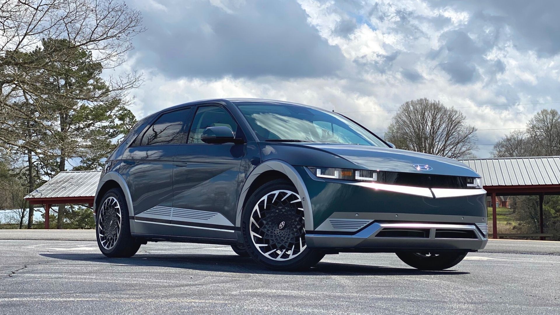

With an estimated driving range of up to 303 miles, a choice of rear- or all-wheel drive, and fast charging capabilities, Hyundai’s Ioniq 5 is jumping into the mix of current EVs on the market. Meant to be a sub-brand (which seems to be a popular trend lately), Ioniq is all new for Hyundai and the 5 gets to be the star of the show. At least, that is, until its siblings the Ioniq 6 electric sedan and Ioniq 7 electric SUV.
The Ioniq’s design team opted for a repeating retro theme for this new car, choosing digital nostalgia in a futuristic setting. It may sound counterintuitive, but the strategy is crazy like a fox; the pixelated design is especially appealing to Gen Xers who remember early Atari games like Pong or (my personal favorite) Centipede. These patterns of repeating squares feel familiar, which may explain in part why I like it so much.


Senior Design Manager of Exteriors at Hyundai Design Brad Arnold said he left “no pixel untouched” in a phone interview with me. The design theme communicates that Hyundai has zoomed into the last pixel, he said, indicating that they have paid attention to the details.
“It’s nostalgic to eight-bit video games and there is a very playful aspect of it,” Arnold said. “In design, we deal in high-res Photoshop images all the time but if you zoom in closely, it’s basically a bunch of pixels.”
While drawing on emotions was unintentional, Arnold said, the design relates to different generations at various levels. If you’re a child of the 80s or 90s, you remember Atari and primitive PC-based games like Oregon Trail. For a younger audience, it’s Minecraft. Arnold says the Ioniq’s design plays on what was a historical element and remixes it. Think Kygo’s remix of the Whitney Houston version of “Higher Love:” it’s evocative of a certain period of time, but different.

Once you start looking around, you’ll start seeing the pixels everywhere: on the door sill, in the seat pattern, adorning the lay-back front seat controls. Where it’s most striking, I think, is on the steering wheel. The vast majority of brands place their logo right in the center of the wheel so there is no mistaking what you’re driving. Hyundai decided to use four well-spaced pixel squares in the center to stay on theme. Andrew Moir, Hyundai senior design manager for interiors, told me that wasn’t an easy decision, at first.
“Internally, there was some resistance because there was a perception that when you’re proud of your brand, you put it on the steering wheel,” he said. “But we kind of feel we want the whole vehicle to explain that it’s Hyundai, not just a badge.”


This is the first car with the pixels and Moir said they are applying them as they go, figuring out where they fit. He also says they’re a placeholder, hinting at future interactive elements. Much like when using Alexa or Siri and you get visible feedback, this is a clue to where Hyundai’s design team is going with it. Imagine, for instance, light-up pixels in the steering wheel instead of static pixels.
“The overall car is kind of an Easter egg,” said Arnold. “It’s something people weren’t expecting from Hyundai.”
It’s a great looking EV and I enjoyed taking it out on some winding country roads north of Atlanta a couple of weeks ago. It will be interesting to see how the pixels evolve in the Ioniq 6 and 7. If it feels anything like the Grandeur restomod from last year, it’s going to be spectacular.
What do you think? Weigh in here or send a note to kristin.shaw@thedrive.com.