
Like much of the modern world, automakers’ websites have all lapsed into the same sameness today. There’s a beautiful high-resolution image or animation, drop-down navigation menus bringing you to either scroll-heavy model pages or a fancy build-your-own configurator with full 3D models. This wasn’t the case around the turn of the millennium, when the auto industry was still trying to figure out this newfangled world wide web. Today, their varied efforts look even more dated than the cars they were slanging twenty years ago—and that’s really saying something in a few cases.
A lot of these websites weren’t archived properly, or have missing images. But some are completely intact via the Internet Archive’s Wayback Machine, downloadable screensavers and all, and they reveal Web 1.0 to be the exuberant, unselfconscious place you remember. Old pages like these are always a hoot, but automaker sites in particular are especially fun to revisit given how desperately they want and need to look cool at a given juncture. This is an endless font of entertainment that we’ll be turning to again in the near future—for now, let’s start with Jeep, Chrysler, and Dodge.
Jeep | 2001
Jeep’s website—sorry, portal—in 2001 was a moment in time, that’s for sure. It was still making the XJ Cherokee and a two-doors-only Wrangler, but it was starting to cross the metaphorical rubicon with its softer-styled WJ Grand Cherokee and the impending Jeep Liberty. Its page is very green, because nature is generally green, and if you like getting out in nature, boy has Jeep got a vehicle for you.
Its landing page also has a red Jeep that randomly drives diagonally across the page every few seconds. You see in the lower left hand corner.That’s fun, huh? No? Where are you going?


Hopefully, on to the next page where Jeep helpfully cataloged all its cool concepts from around that time. Among the many I either forgot about or never knew it made are the hydrogen fuel cell-powered Commander and hot sauce-inspired V8 Wrangler Tabasco. They also made something called the Varsity which they refer to as a sports sedan. To me, it looks nothing like a sedan, but today I’m sure it would pass off as something at least close to that. Most of the other concepts—besides the Jeepster—seem pretty tame.
The Jeep page reminds me of boy scout camp when I was a kid. Earnest, American, and trying to figure out where it belonged in the 21st century.
Chrysler | 2003
Chrysler’s website from around 2003 is another prime example, less so for its early-Aughts awfulness and more for the fact that it’s nearly perfectly preserved. A lot of stuff is still functional, the menus all work, and most of the images show up. Even some of the downloads are still hosted somewhere—more on that in a second. I don’t recommend trying to order PT Cruiser, though.

The Chrysler Crossfire was brand new in 2003, so it was the focus of their web page back then. There’s some other sort of funny stuff here, too. You can see at the bottom there’s a link for a ‘PT Block Party’. Unfortunately—or maybe fortunately—it leads to a dead page. I did a bit of searching and found a vintage forum thread from 2004 that shows it’s exactly what you’re imagining. It starts with a line about that year’s event would include “our kissing cousins (the Chrysler line up of enthusiast vehicles) to make this the biggest party ever!” I don’t recommend you read all of it.
Navigate to the Chrysler Design Institute section and you’ll find both a defunct e-cards sender (Yes, I tried to send myself a Chrysler concept-themed e-card, so what?) and a functional feature whose discovery proved to be one of my most exciting lockdown moments: If you navigate to the screensavers section, you’ll find three vintage ones with active download links for the Crossfire, Pacifica, and the Design Institute itself.
If you’ve got a PC like I do, go ahead and download one. I chose the Crossfire, of course, and was rewarded with a compressed file labeled crossfire_saver. I went in and checked the installer—a whole 1.5 megabytes, which is why it had to be zipped for computers in 2003—and gave it a whirl. Incredibly, it worked and successfully installed the following screensaver:

Jealous? I know.
Dodge | 2003
If the Jeep page reminds me of boy scout camp, the Dodge page reminds me of the channels I wasn’t technically supposed to watch. No, not those channels—the violent, action packed stuff that would’ve corrupted my still-developing brain.
The landing for their SRT page is pretty neat. They were making the second-gen Viper, SRT-4 Neon, and SRT-10 Ram 1500, all at the same time in 2003. “Drive it like you stole it” adorns an aggressive header image of these 3 vehicles. They’re all looking positively furious.

Adjusted for inflation, the Neon SRT-4 isn’t actually that cheap. You can get an EcoBoost Mustang or base Camaro for less than that nowadays. Though, The SRT-4 was a genuinely great version of an otherwise awful car. And check out that description for the Dodge Magnum wagon on the right hand side. “Sheer guts. Raw Nerve. All Dodge.” I’ve never been more scared of a Dodge Magnum.
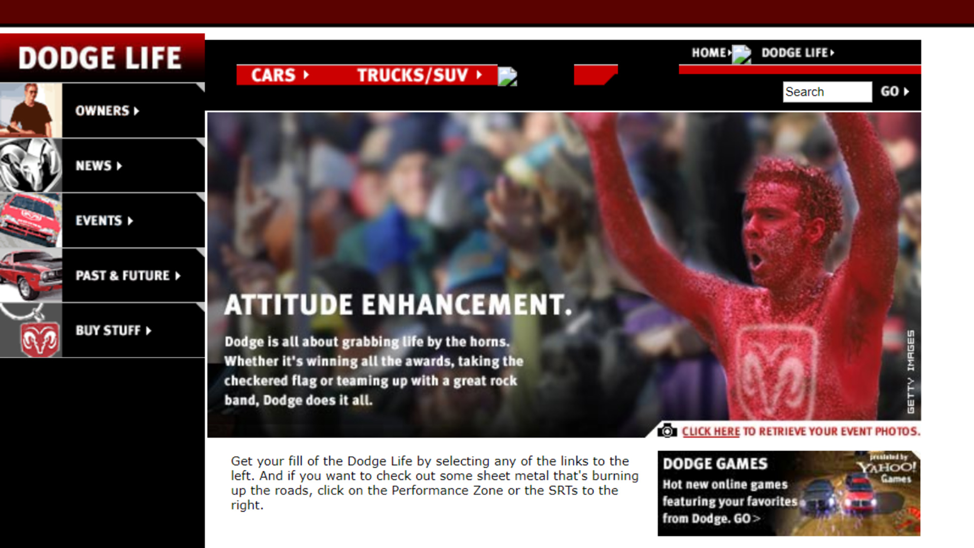
The page for Dodge’s non-performance website is very 2003. Not all of it was successfully archived, with a few pieces missing. Unfortunately the games advertised on the front page are no longer playable. That was pretty disappointing for me, to be honest.

There’s this friendly red man on the landing page with a Dodge logo painted on his chest. I’m almost certain it’s a Photoshop, which makes it even weirder. Imagine the instructions that graphic designer received to make that image. The look on his face makes me uncomfortable. I’m not sure if I would enjoy grabbing life by the horns.
Got a tip? Send us a note: tips@thedrive.com