
We may earn revenue from the products available on this page and participate in affiliate programs. Learn more ›
The Subaru WRX STI is an apex predator in the performance car ecosystem, wowing fans around the world for decades with its all-wheel-drive antics. The Société des Techniques Innovantes is an industrial supply company in France that makes road signs and traffic barriers. And somehow, both have almost exactly the same logo.
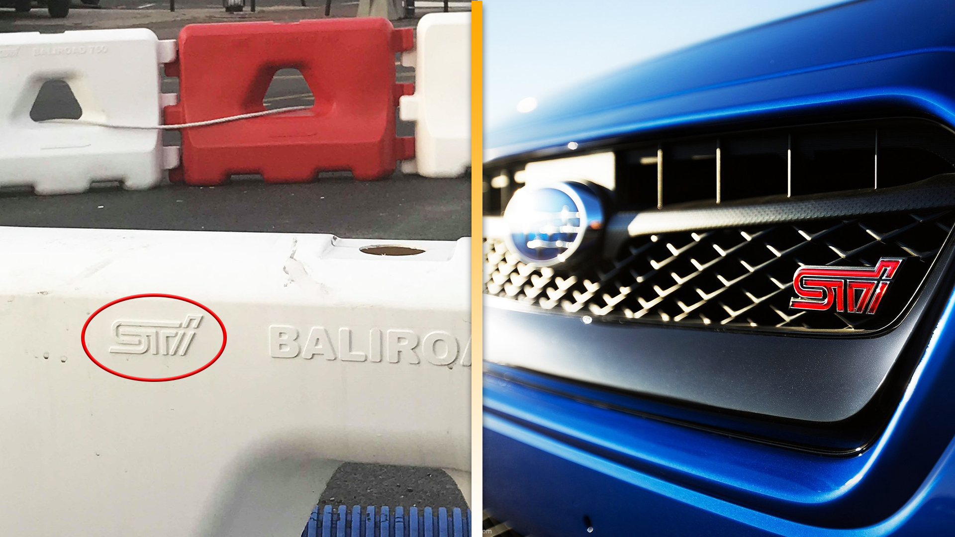
Graphic design can be a derivative game, with unintentional parallels in things like font, shape, and color choice following broader cultural trends. But there was no mistaking the iconic double-lined Subaru Tecnica International logo that a tipster spotted stamped on a plastic traffic barrier outside Paris earlier this month. No, Subaru hasn’t gotten into the Jersey barrier game—Société des Techniques Innovantes seems to have lifted the design from the Japanese automaker, as Jean-Eric Hoang’s friends pointed out when he posted a picture on Facebook.

For a company whose name literally translates to the Society of Innovative Techniques, it appears to have taken precious few safeguards in copying Subaru. On the plastic barrier—one of those interlocking units you’ll see lined up to manage a temporary traffic situation—the single difference is that the I is detached from the ST, while the logo on the car is a seamless stroke.

Weirdly, that design doesn’t appear on the company’s website, which displays a completely different version of the logo with overlapping block letters. However, you can see the same “Baliroad” branding for the barrier in both the site’s Temporary Road Signs section and the image supplied by Hoang. And when The Drive emailed Société des Techniques Innovantes for comment, its response unintentionally answered one question and raised another.
“Our logo is just a contraction of the name of our company, which deals with road equipment and has nothing to [do] with automotive. We have never heard of the car you talk about,” Jean-Pascal Grivet wrote.

Below that blanket denial was an email signature featuring the very same Subaru-STI-looking logo—except this time, the ST part was colored green and the separated I was styled with a dotted line up the middle to look like a road. So the company is sticking with both its fairly obvious copycat design and its non-explanation, probably hoping that these tweaks and its limited online presence are enough to avoid getting sued for copyright infringement.
How this might have happened is still unclear. There’s just no way someone independently arrived at that design, which has adorned Subaru’s motorsports division since its launch in 1988. The website for Société des Techniques Innovantes states that it was founded a year later in 1989, but again, the older logo seen there proves it hasn’t always looked like that. The representative who responded may have never seen an STI in his life, but it’s safe to say that someone in their graphic design department did.

As you might guess, the automaker finds itself in the opposite situation regarding this random company in France. A Subaru spokesperson told The Drive that while it hadn’t heard of Société des Techniques Innovantes or seen its products bearing a very similar STI logo, its legal team is now investigating the issue.
Whether or not anyone ever owns up to being the Subaru superfan on STI’s staff, this kind of completely-avoidable incident shows how silly it is to try to get away with this kind of blatant copying in an age where everyone is carrying a camera. Sooner or later, people will find out.

