
We may earn revenue from the products available on this page and participate in affiliate programs. Learn more ›
When I’m in New York I spend most of my waking hours in bars and restaurants. In Los Angeles I spend most of my time in the car. Maybe my respective (and completely separate!) drinking and driving habits are more pronounced than most, but in LA your car really is a home-away-from home. So our ongoing series in which residential interior designers critique automotive interiors seems even more appropriate here in the City of Angels.
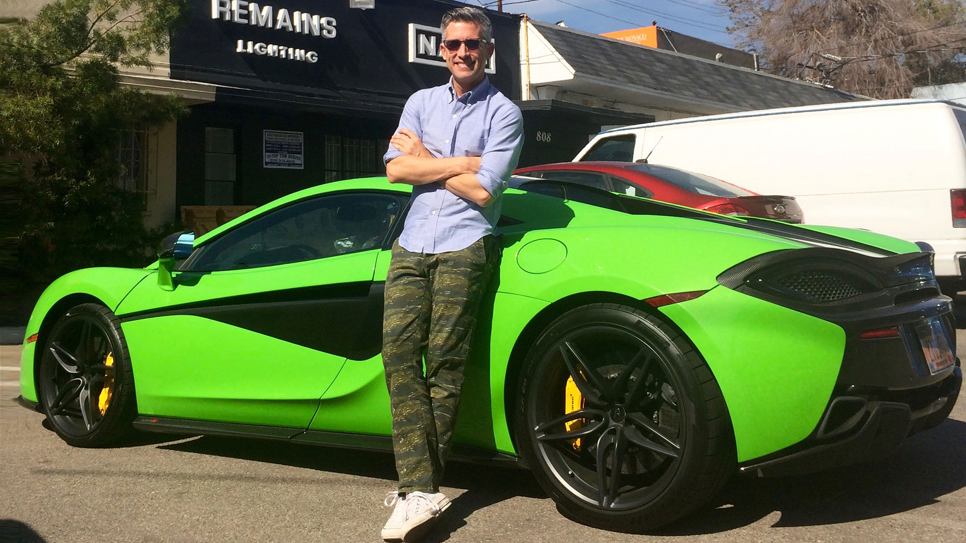
Supercars don’t typically offer much in the way of interior space, but cruising the city’s surface streets and superhighways in the $182,000 McLaren 570S admirably showcases the company’s first foray into the realm of the “everyday” supersports car. It’s more comfortable and less track-focused than previous offerings (but still wildly capable, make no mistake) and attempts to inject a bit more affection and repose into the somewhat austere and technocratic British brand.

To help figure out if they’re succeeding, I invited interior designer, committed Instagrammer, and retail showroom curator Joe Lucas to join me in a blast along the twisty bits of Sunset Boulevard.
“You can’t have back problems getting in and out of this car,” Lucas says as he swivels under an upswinging dihedral door and contorts himself into the high-bolstered and non-adjustable black Alcantara racing seat. “Or you will, eventually.”
Lucas finds the interior less outrageous than our eye-searing Mantis Green model would suggest. “I was sort of thinking that it was going to be some crazy color inside,” he says. “But it’s actually very sleek and all black, which is great.” Given his two big dogs—thankfully left at home for our excursion—he adds: “I would probably want a lint brush for the ultra-suede dashboard.”

Lucas is especially taken with the design restraint shown in the dashboard and center console. “I like how minimal the displays are—it’s not some big, crazy thing. The middle display almost seems like a miniature version of the Tesla (Model S), which is like a massive iPad, which always confuses me. I would want to have, like, Friday Night Lights playing while I’m driving,” he says.
That moderation plays to one of Lucas’ founding design principles: allowing “a place for the eye to rest.” Creating an overall feeling of calm in a room, he says, allows one or two signature pieces to shine through. In the 570S, the eyes are drawn where they should be when you have 562 horsepower and 443 lb-ft of torque available with a press of the foot: forward.
“In here, the dashboard is the natural place for the eye to rest, so that you’re concentrating on driving,” Lucas says. “Which is good, since this is the kind of car you need to concentrate to drive.”

As eye-catching as it is, Lucas wishes that the chartreuse exterior adhered more closely to this rule. “I would be perfectly happy with [the exterior] in all black, as well. There’s nothing wrong with a sleek black car. And people still hear it when you drive by.”
In his work, Lucas is drawn to a classic and comfortable aesthetic, like leather club chairs and rustic wood finishes—a far cry from the McLaren’s technical and synthetic materials and sharp edges. But he imagines those details finding a home in other design applications. “I could see the funkier, cooler look being easily transferable to a plane interior,” Lucas says. “When you do a private plane, that’s where you can have a little more fun.”

Lucas also has some fresh ideas for breathing a bit more breathing room into the McLaren’s cave-like black cabin, like the sparing application of a highlight color. “Maybe a contrasting leather in the seat cushion, or a stripe over each seat in the roof,” he says. “Just so you’ve got something cool going on above your head.”
He also recommends subtly patterned materials like woven or etched leather and lightly speckled carpets to add texture. Or even something more dramatic: “Wallpaper is great. There are so many amazing ones out there. That can certainly sort of be the jewelry of the room, so to speak.”
To amp up the sense of occasion Lucas also suggests a touch of mood lighting, like the ambient LEDs available in his Audi Q5. “Does it have a glow inside?” he wonders. “You know, almost like in Virgin’s planes, that little bit of purple everywhere.”

This discussion of color and mood reminds Lucas of a tactic one of his designer colleagues uses. “He always matches the wall color in the master bedroom to the wife’s eyes,” he says, rolling his own eyes. “I’m like, ugh, you’re such a cheeseball! But I bet it works every time. “You have these beautiful, Capri blue eyes. Let’s match that…”
Lucas final proposal focuses on usability, circling back to the significant hours people spend in their cars here—so much that they’re often forced to eat and drink behind the wheel. “That cupholder looks really hard to reach,” he says, pointing to the shallow, flimsy indentation back behind the 570S’s center display.
“But then again,” he corrects, “you’re probably not drinking much when you’re in this. I feel like this is a two-hands-on-the-wheel kind of car. I don’t think I could drive with my knee and eat an In-and-Out burger like I do in my car.”
